STARTING POINT
A striking thing about Sainsbury’s history are the many parallels between the ideas it has adopted in the past and the zeitgeist of today, and in many ways how it applies to the future as articulated in the future.
WHAT WE DID
The team at beyond created a narrative framework to drive the design of a living platform, where strands of content are added over time to extend the story. Such a brilliant idea! All the teams have been involved in the project, creating a skills synergy where copyright, insight, design, ux, engineers, product managers and stakeholders had a significant input at each stage of the project.
“People with a stronger sense of nostalgia are more likely to take a positive view of life. People with a stronger sense of their roots feel more socially connected and more securely attached, leading to a greater appreciation of the meaning of life.”
THE NARRATIVE FRAMEWORK: CONTENT & EDITORIAL STRATEGY
How bring to live 150 years of archives? That was the BIG UX challenge to face on this project.
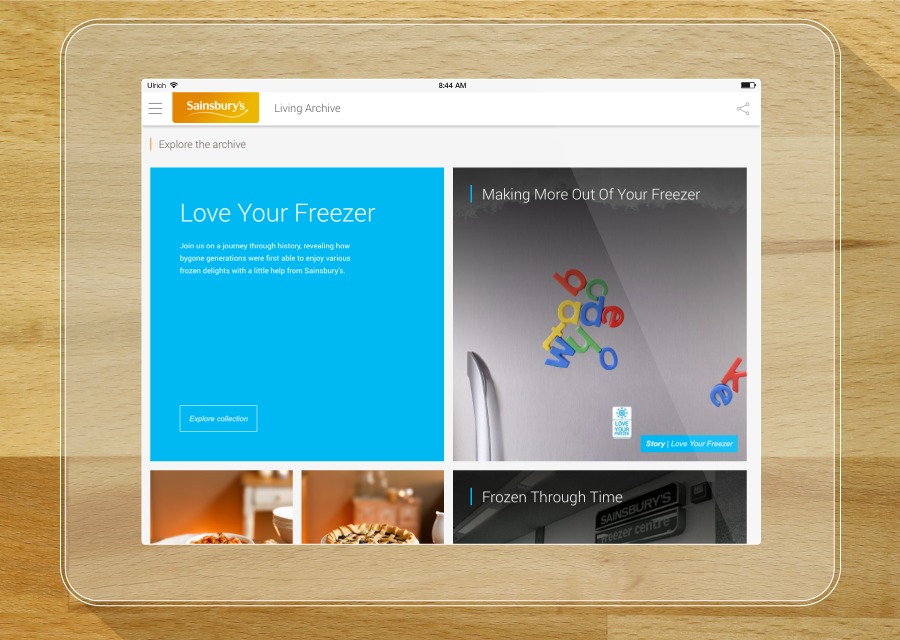
Therefore, we had to start somewhere and we produced a narrative framework where Sainsbury's could periodically create seasonal campaigns to bring a bunch of related archives to live. Here is how the framework looks like:
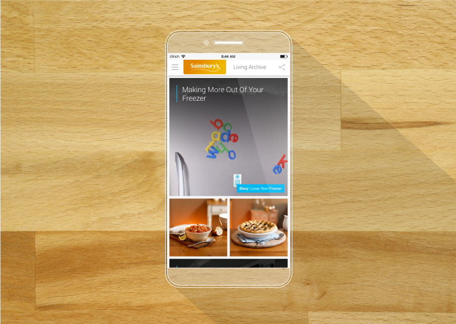
How this works? Each year seasonal campaigns are taking place on the website. Each campaign showcases a serie of stories. And each story contains audio, image, video archives related to the period of time. And over the time the majority of the archives will be digitalise and accessible online through rich, beautiful and real stories.
That was it! Now, where do I fit into this?!
HERE'S WHAT I DID AND HOW I DID IT
DAY 1 & 2: DEFINING THE INTERACTIVE MAP
When I knew that we would be using stories to bring to live the archives, I instantly wanted to map everything out; stories and interactive assets (animations, videos, audio files, images). I was obsessed of having a good balance between the amount of content for each stories. Indeed, I recommended to keep the amount of content as even as possible. Meaning if one story has 2 videos the other stories should at least have one video or other assets to keep the amount of time spend on each page even.
However, sometimes stories didn't have enough related archives to balance the editorial strategy, so I added interactive elements to translate text, dates, numbers into playful digital interactions: interactive slider, dynamic diagram or an advanced lightbox. Here is one of the map - the first eight stories around "Christmas" for launch - including content, assets and "interactive benchmark":
Click to enlarge
Click to enlarge
DAY 3: NAIL DOWN THE USER JOURNEYS
To put everything in context and moving forward, "campaigns" as introduced earlier are labelled "collections" of stories and "archives", "assets". You can see below the initial draft of the core acquisition journey:

Today, I reckon that I could optimised this core acquisition journey based on the traffic. Indeed, we've seen decreasing the amount of unique visitors on the homepage but increasing on stories. One of the main reason is that each time a new campaign is released, the entry points (social network and headlines) drive the users straight to the related content. But to increase retention we have introduced sign-postings cueing towards "the next related story/campaign" at the end of each story to streamline the journey. Where topics tags support a browsing and cherry picking experience.
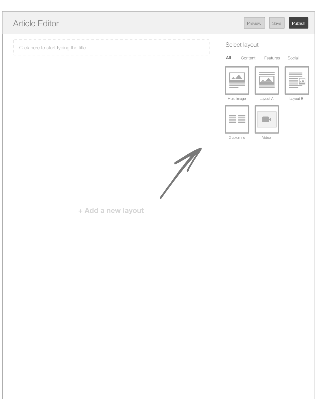
DAY 4: SHAPING THE FOUNDATION
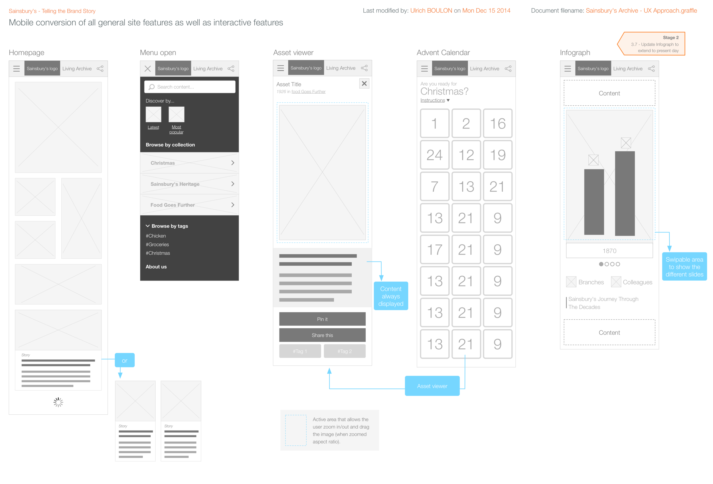
When I started the Information Architecture, I mainly focus on the navigation and the article structure using a card sorting in collaboration with the content team. For the homepage, the firebox.com-like grid is based on a custom version of Masonry framework developped by my friend and talented javascript developper Ryan Marchock.
On the other hand the designers and front-end guys wanted to have an clear overview of how the fluid story layout would work across devices to manage scope and expectations:
Low-fidelity layout to define the breakpoints helped the team with the responsiveness of the design.
Click on the image to enlarge
High-fidelity mockups of the 3-up (320px, 768px, 1024 and more) resolution.

DAY 6: BRINGING THE INTERACTION DESIGN TO LIVE


At this stage the challenge is to find the best interactive modules that sits in each story and matches the the content planning.
Therefore, based on the content planning here is the list of final interactive modules suggested and integrated:
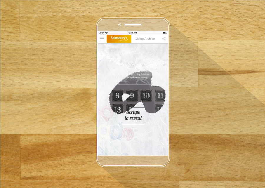
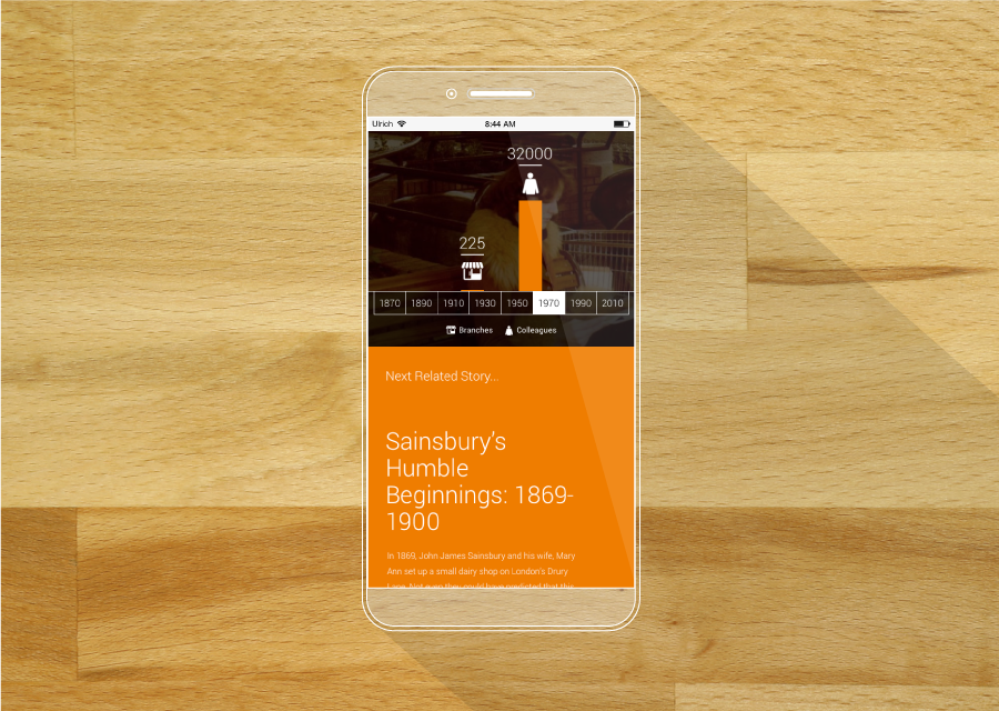
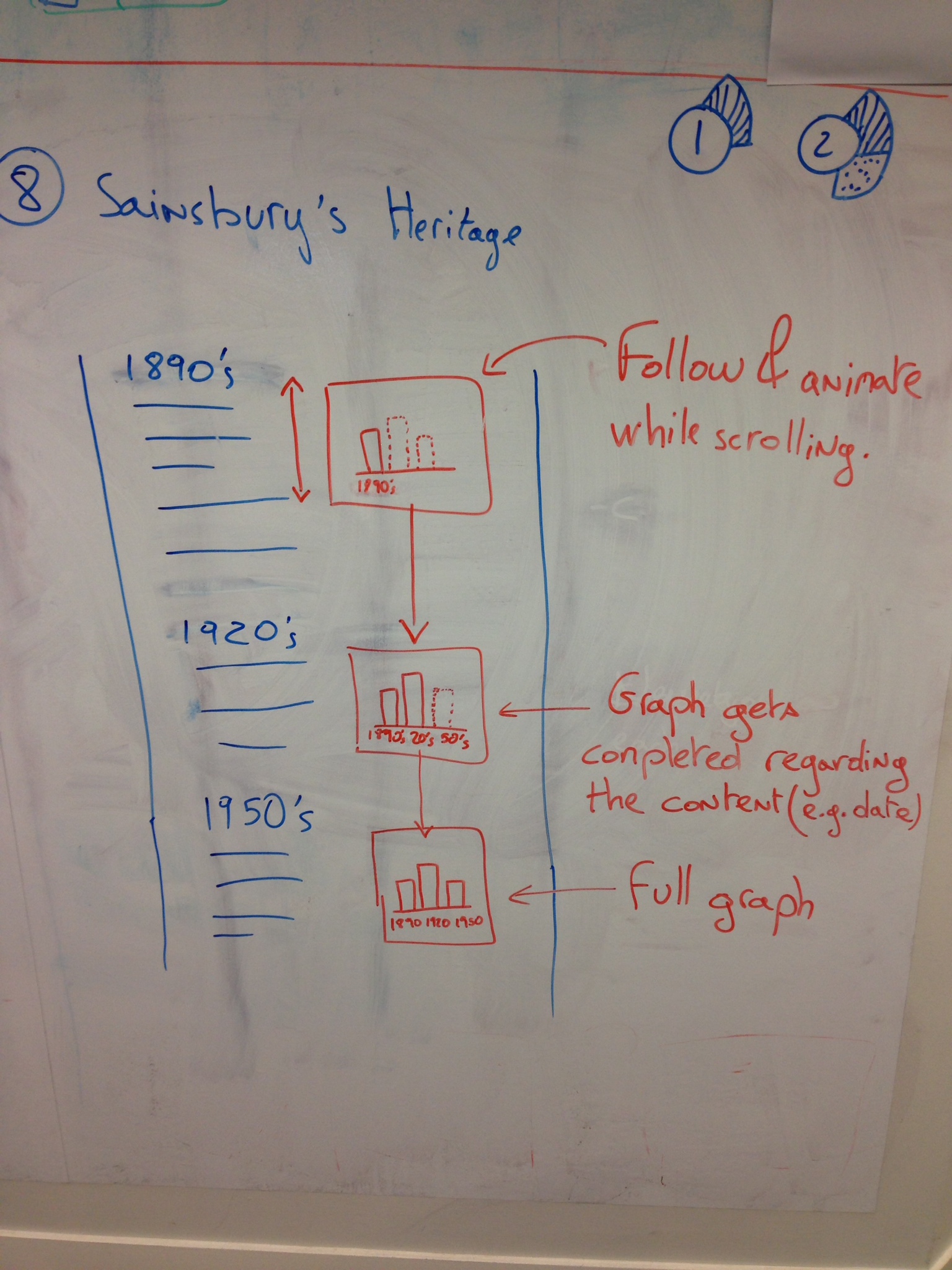
ANIMATED DIAGRAM
The dynamic diagram is designed to put numbers, scalings within a visual context.
Click to enlarge the specs A
Click to enlarge specs B

Click to enlarge specs
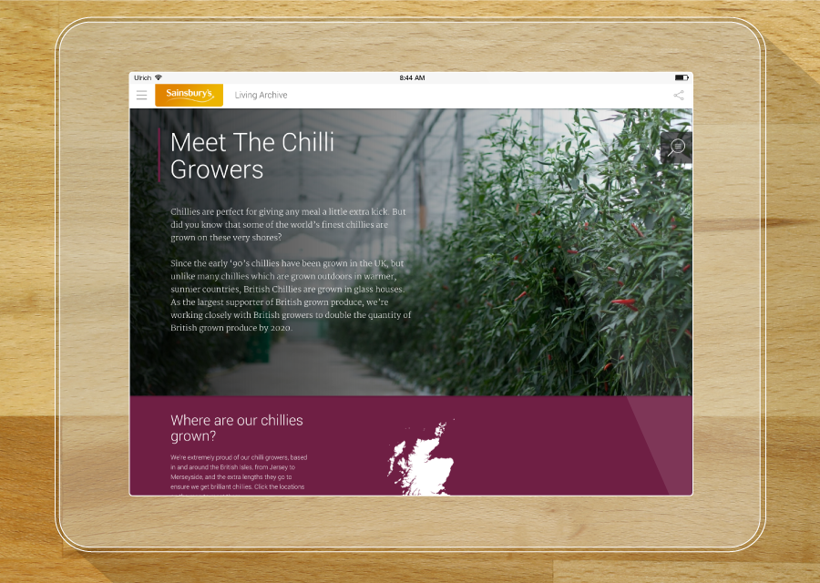
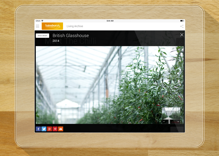
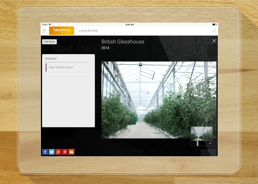
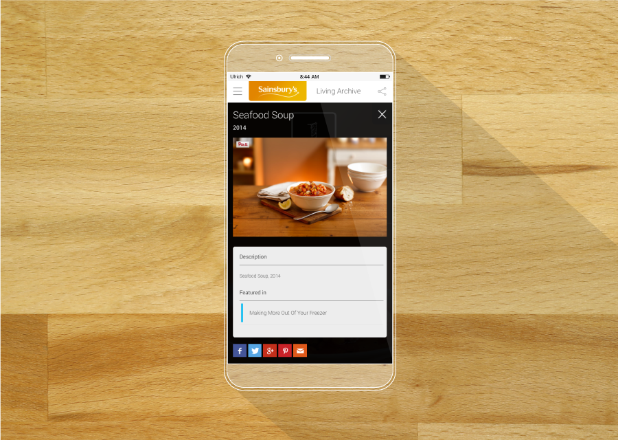
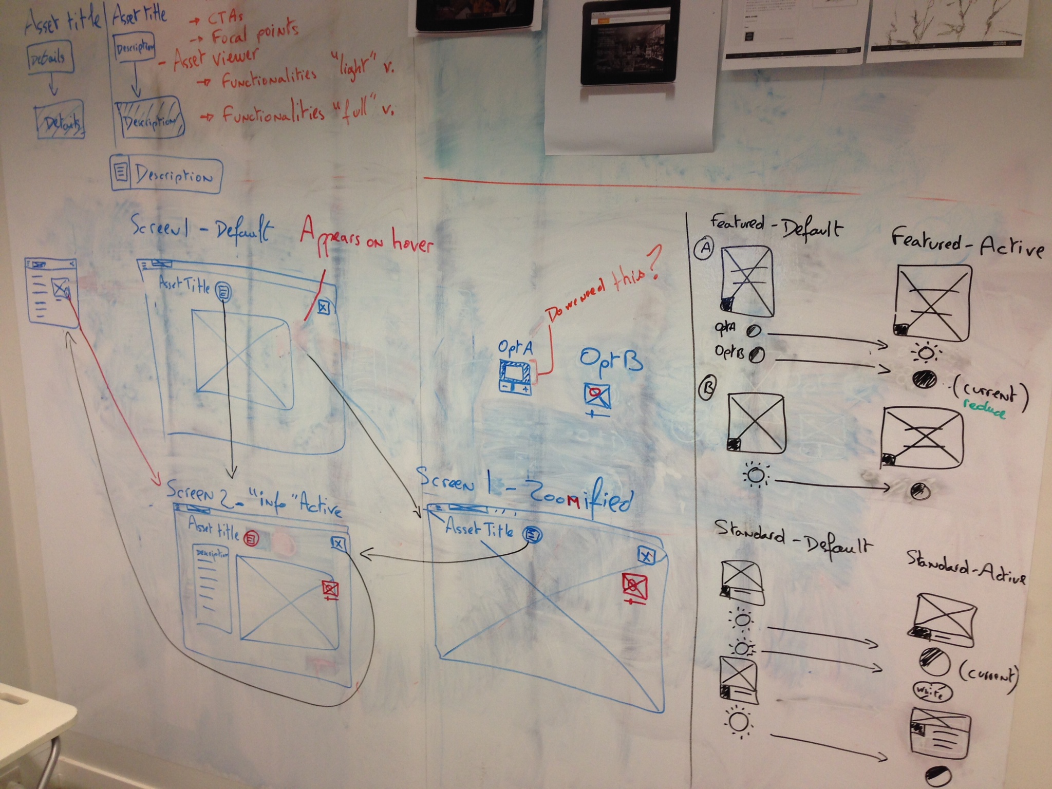
ASSETS VIEWER
The images needed a way to be viewed, zoomed in , described and shared. So, I replicated a model that we've designed at Bynd before for Google Cultural Institute. The user will be inform that the viewer is available when the "info" icon will be visible at the top right corner of asset.

Click to enlarge the specifications
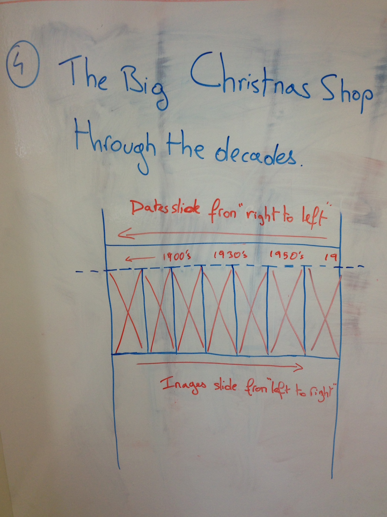
COMPARISON SLIDER
Often, within the scanned archives we found images from the past and present.
A pleasant way to display and interact with both at the same time is to use a slider which helps the user to see at a glance the before and present. The handle being center-aligned to ease the understanding and the motion.

Click to enlarge the specifications
HOVER-STATES ON DESKTOP ONLY
Hover states are delightful - when well done - and play a key role to support the visual design, appeal the eyes and engage the click. The speed consistency is also a key parameter to carry through all animations, often by putting the same speed to start and same speed to end. All animations have been using linear transition. I really like spring animations, probably something to look at on another project.


NAVIGATION BEHAVIOUR
We tried to create a navigation as simple as ubiquitous, meaning that if you need to reach a campaign or a story you can do it as quick as possible with a two-level top navigation. Otherwise, tags and signposting are available to encourage a browsing experience.

Top navigation behaviour

Signpost towards the next campaign related story
AND MORE WITH TACTILE AND PARALLAX BEHAVIOUR FOR MOBILE
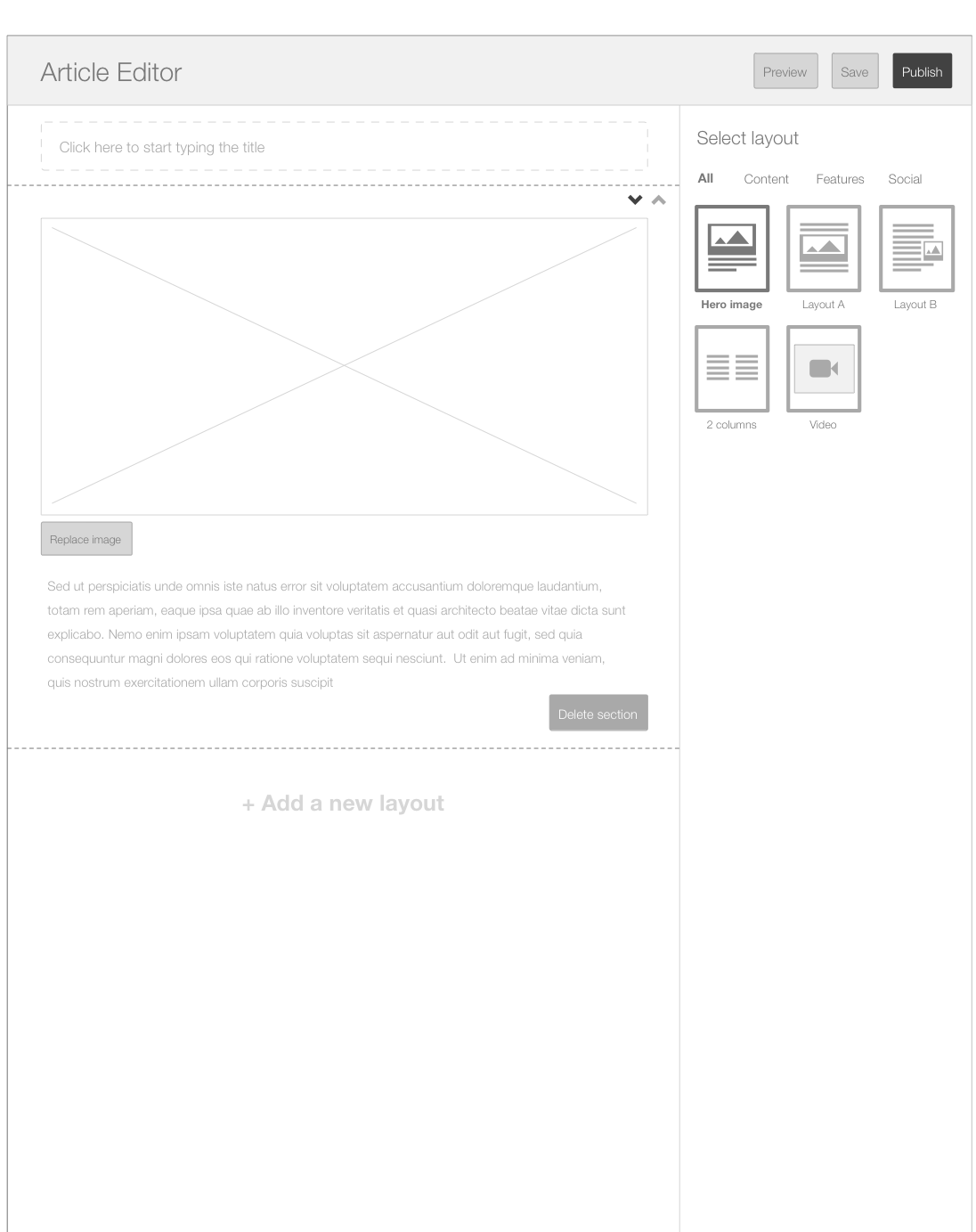
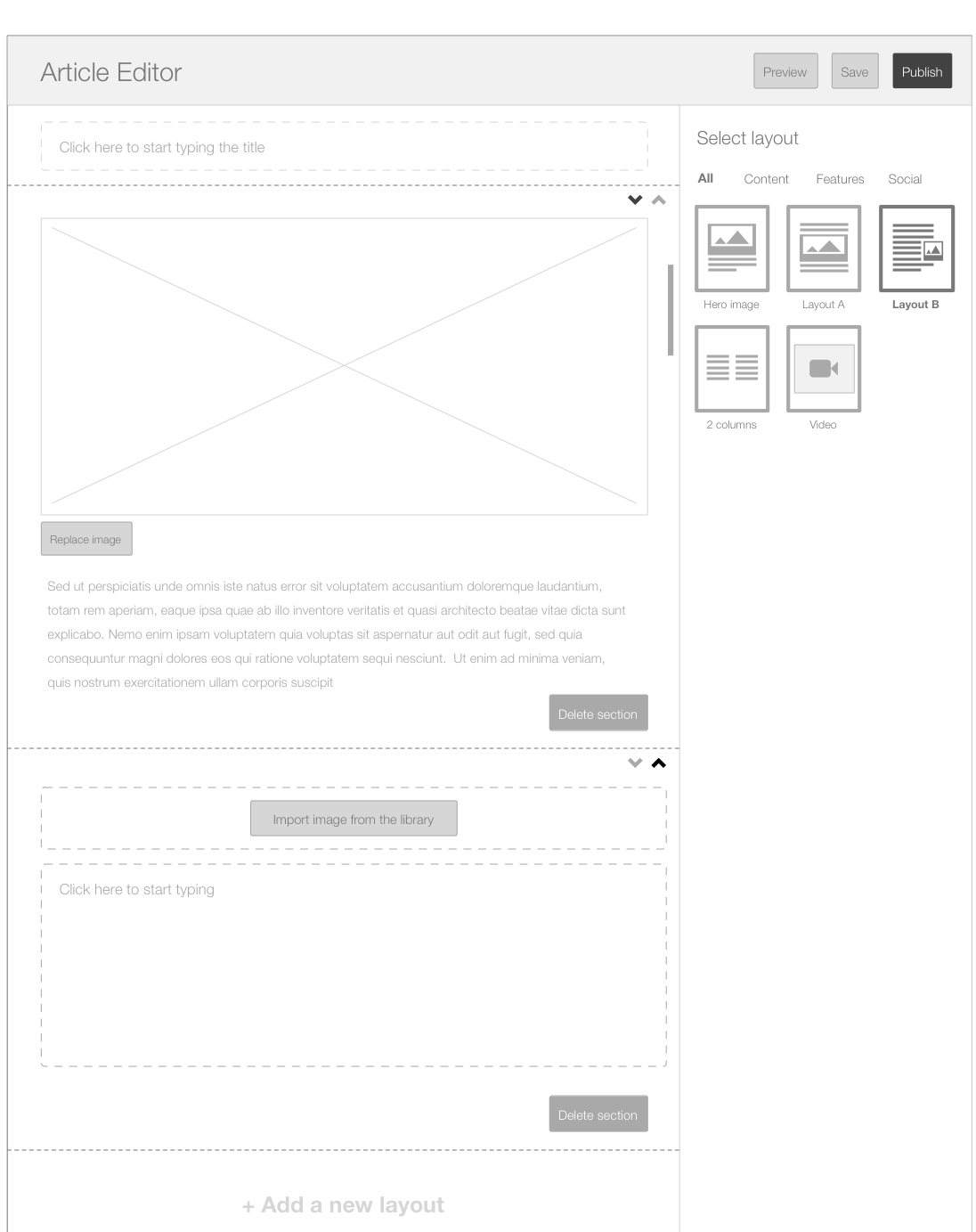
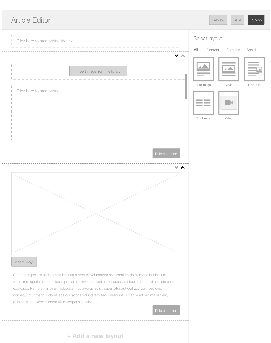
AND OF COURSE WE TOOK CARE OF THE CMS PART TOO
I had the chance to suggest an sophisticated approach to the CMS. An adapted version to ease the collaboration and the publications workflow and the collaboration between editors.
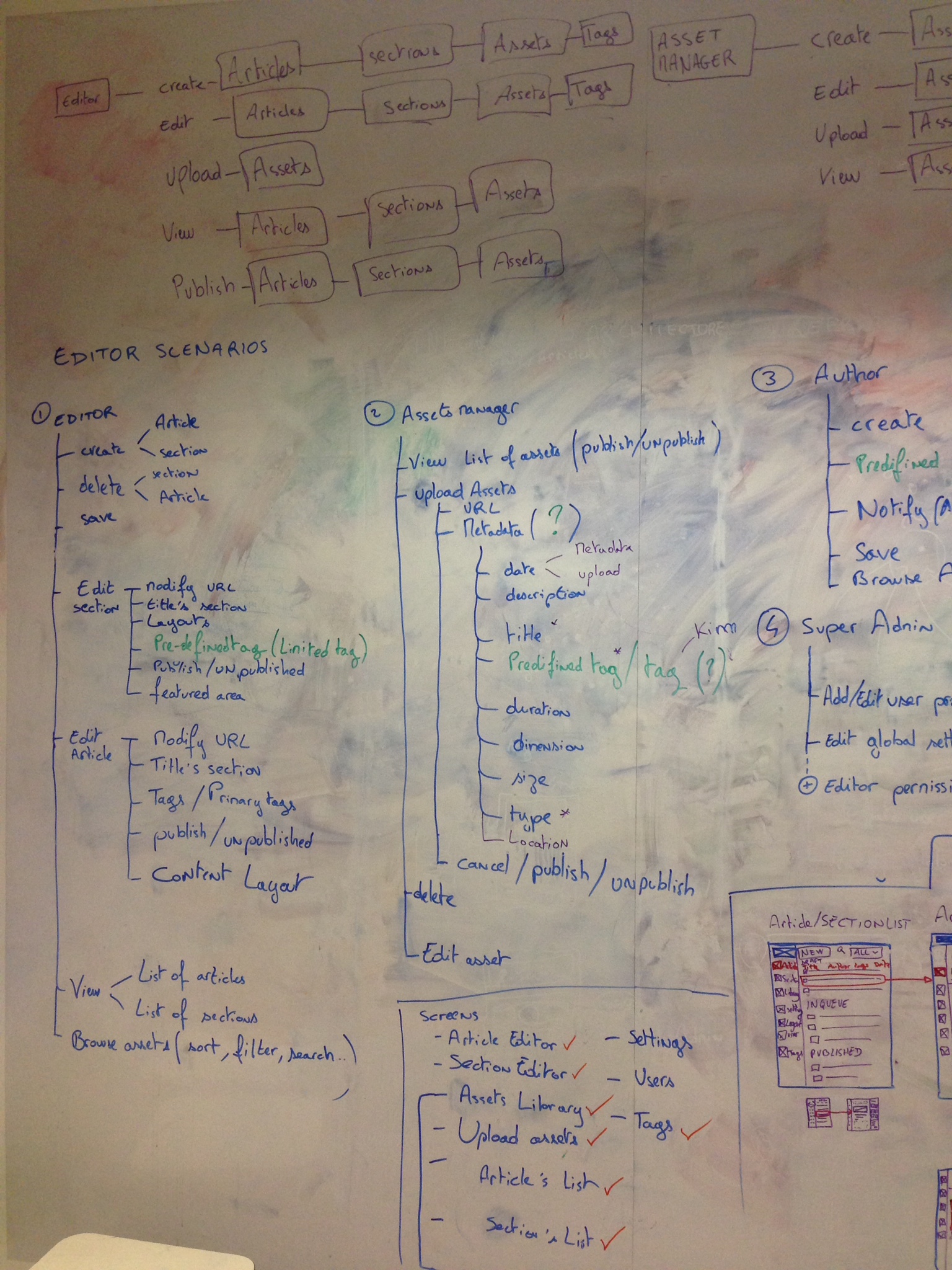

CMS PROFILES' WORKFLOWS


SUPER ADMIN FLOW
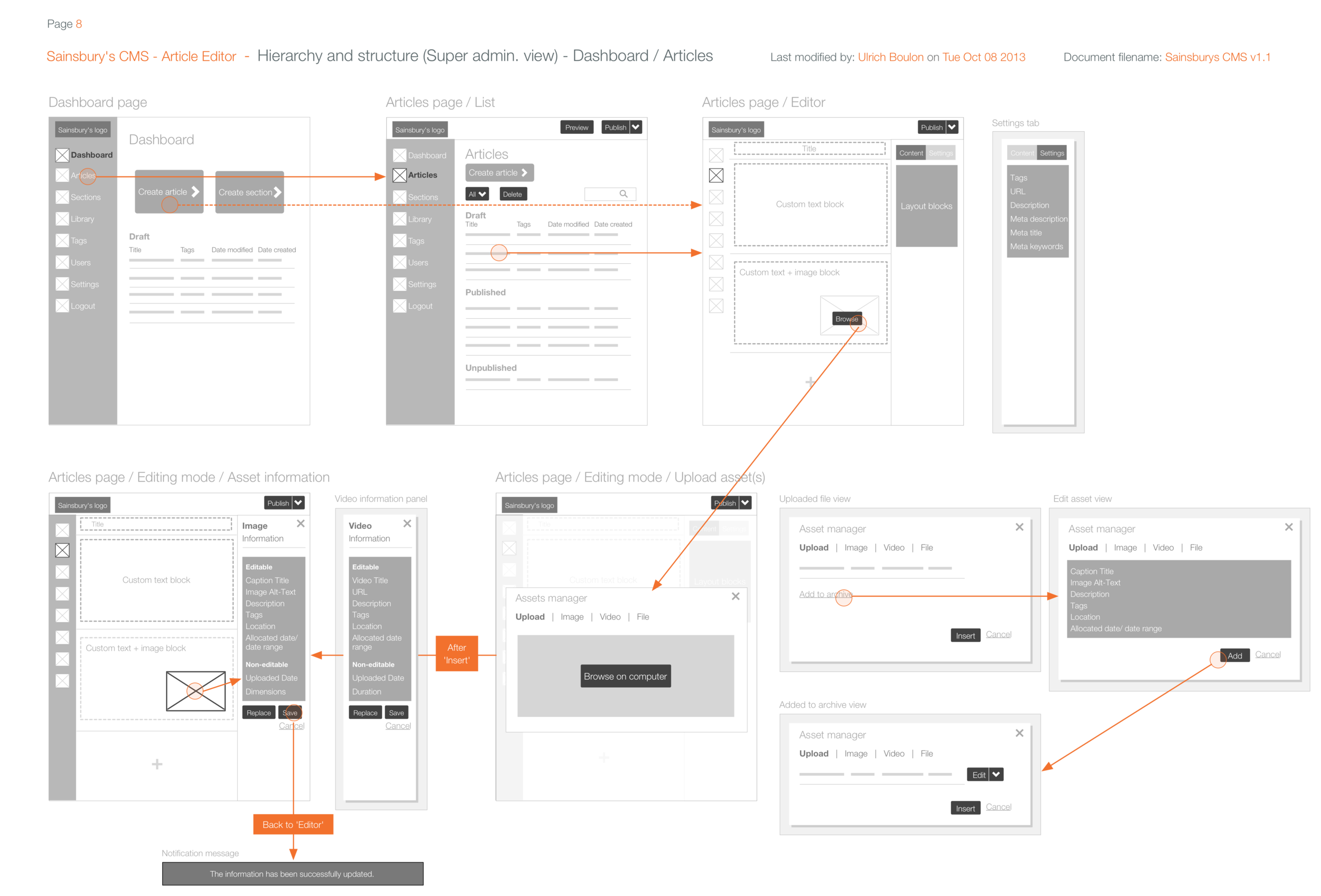
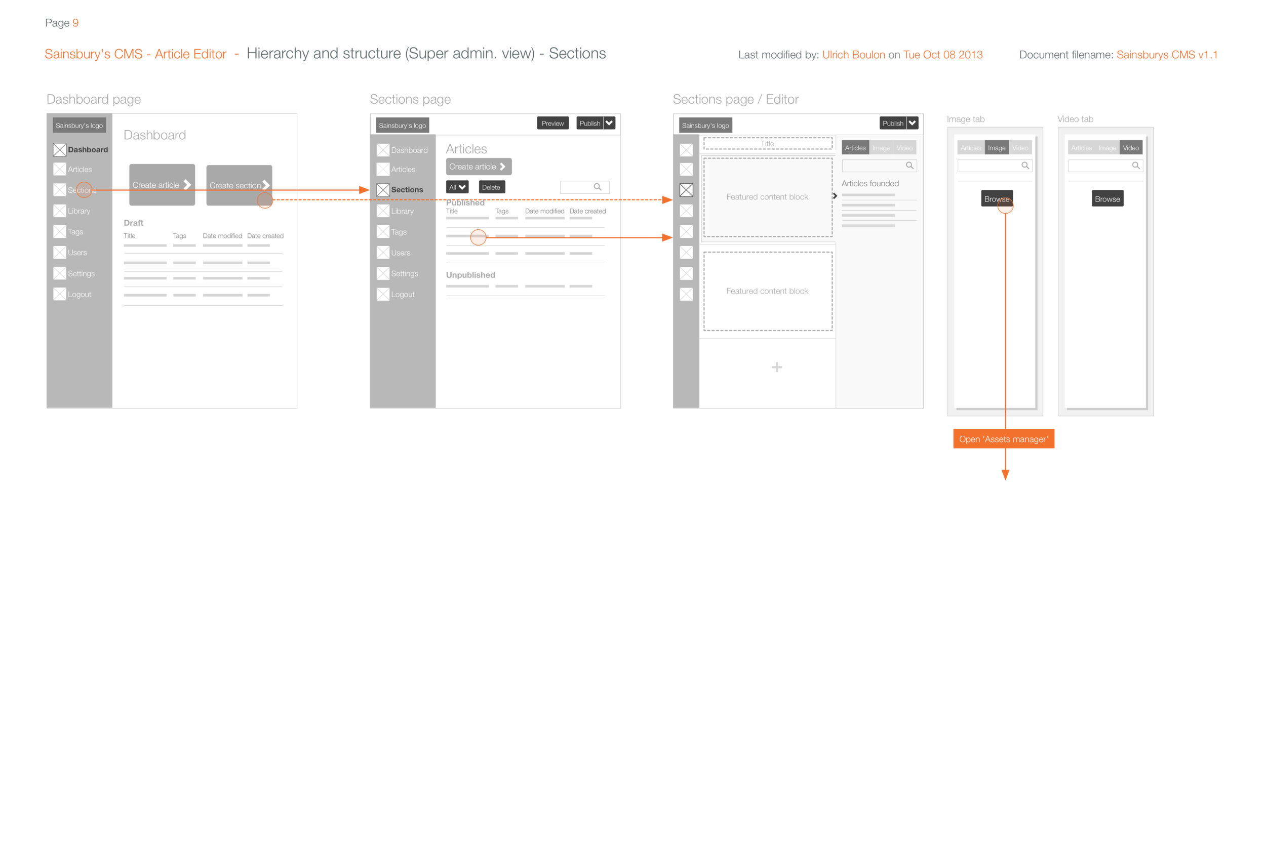
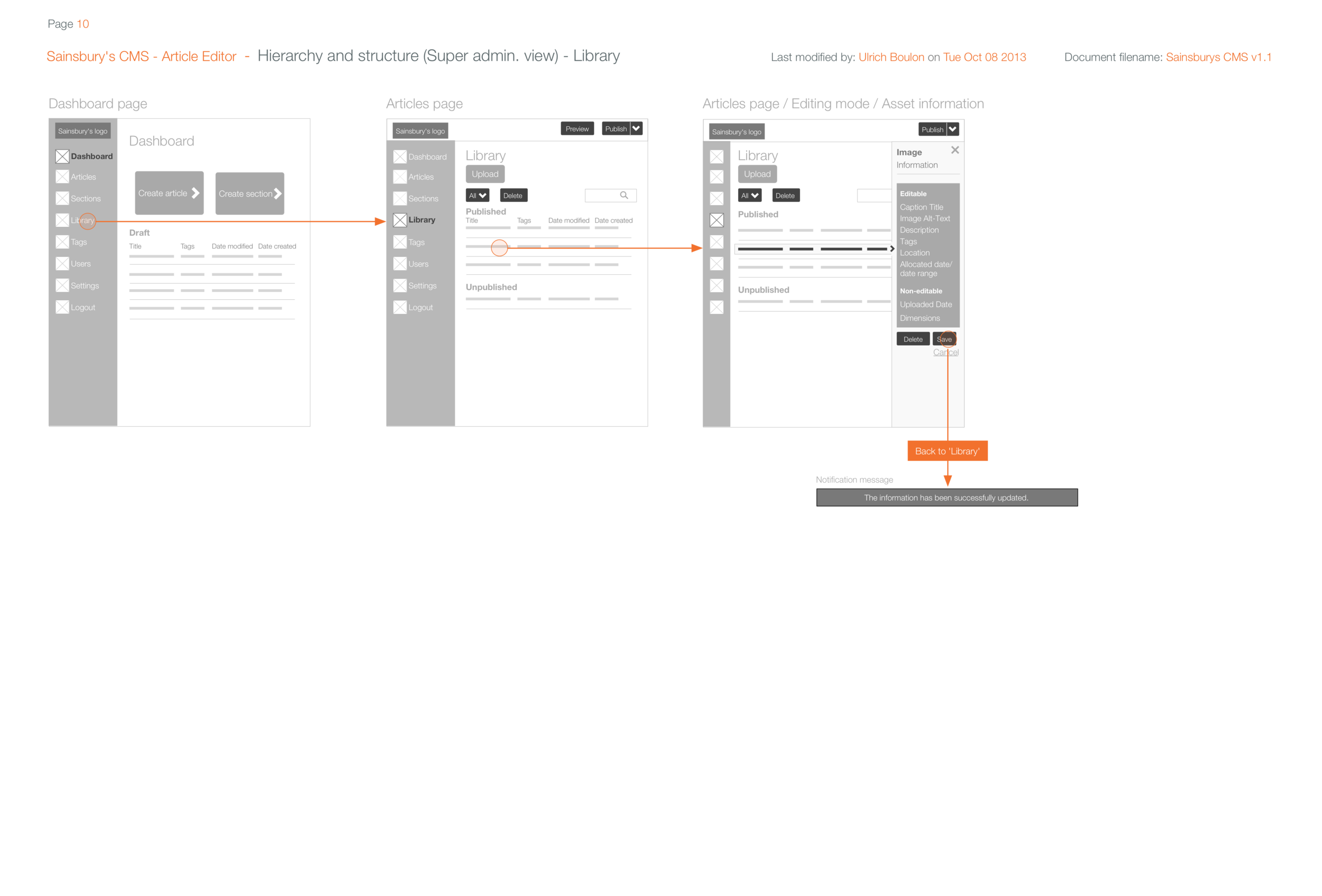

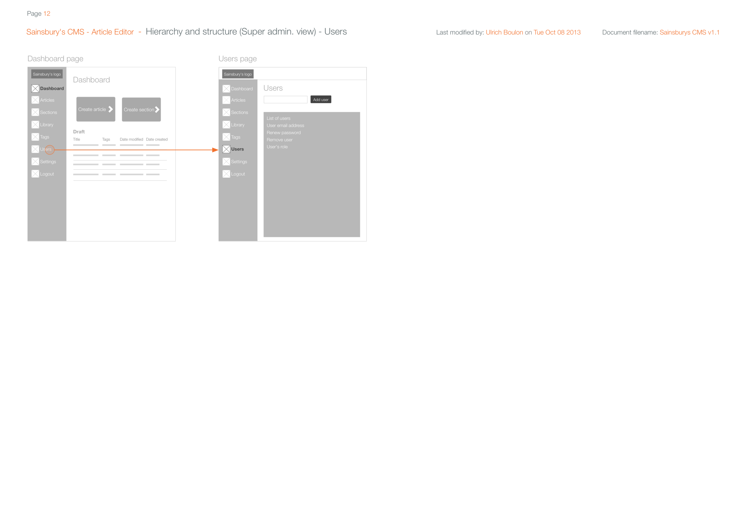
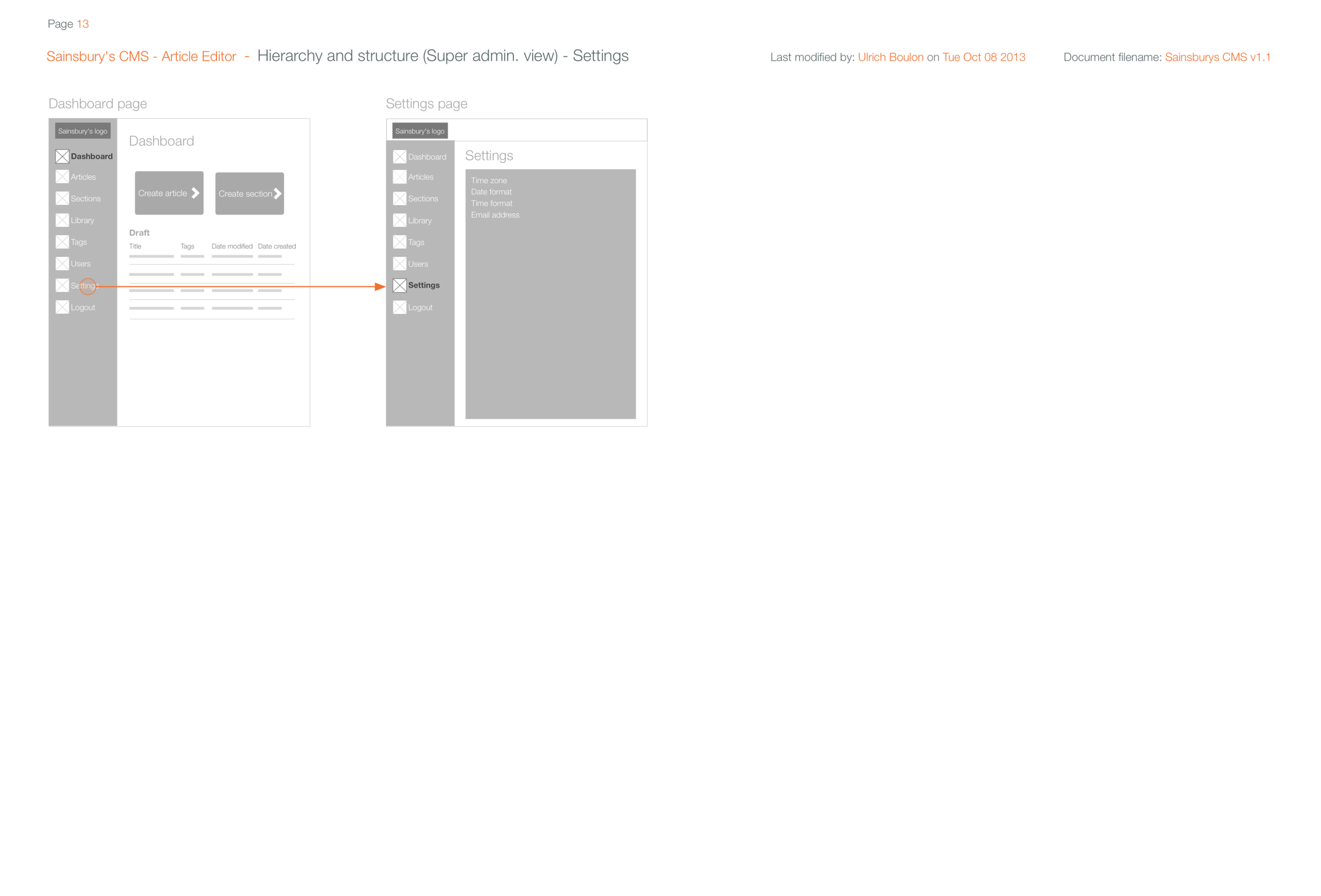
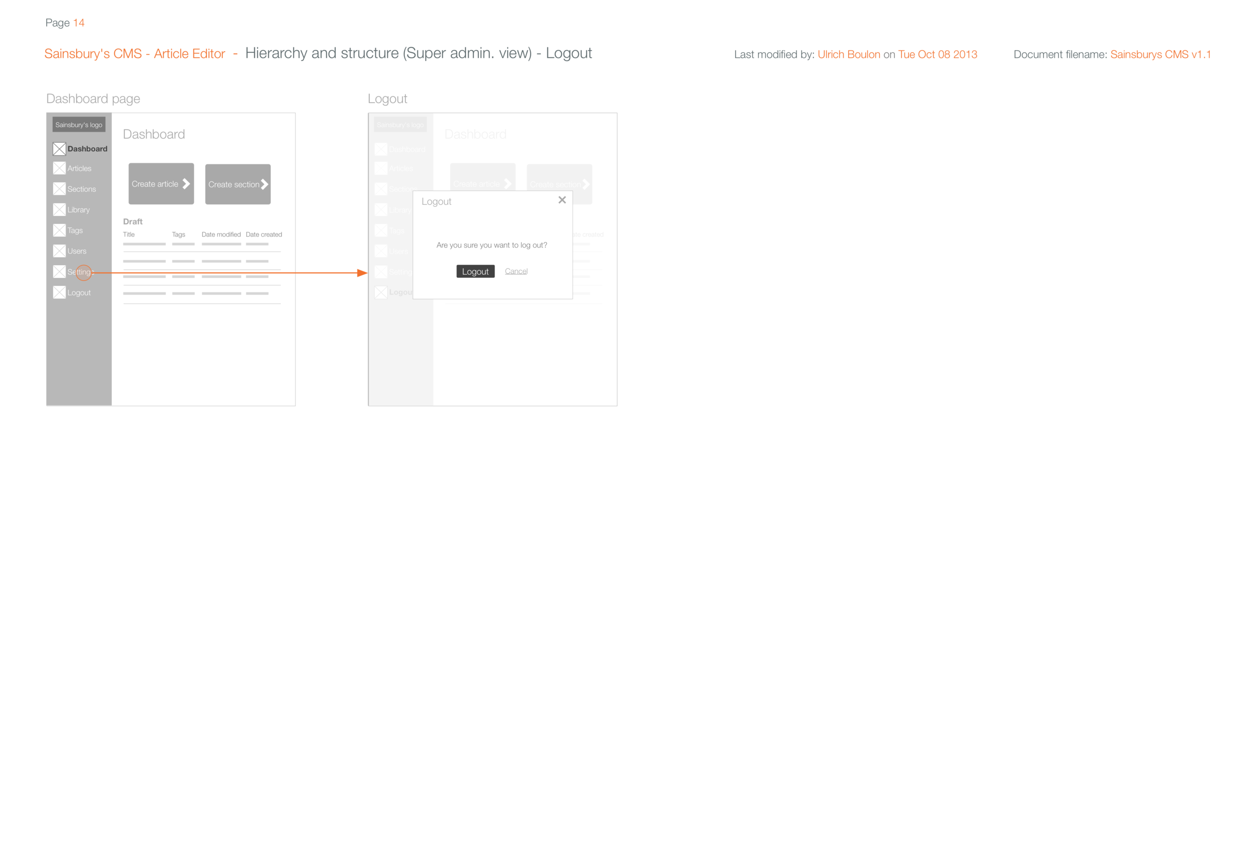
USER INTERFACE
Hope you enjoyed reading Sainsbury's Living Archive case study.
More will come soon. Just watch the space and enjoy the show...
FEEDBACKS
“Now would you be able to tell the brand story throughout our next Phone Shop by Sainsbury’s?!”
SHOWCASE TIME