
FASHION GOES UX WITH GOOGLE BRAZIL
Google Brazil asked us to give a new spin for 2013 to Youtube MODA a fashion channel produced in association with C&A. Keeping in mind that vloggers (MODA term for actual 'bloggers') provide the content, a fashion brand sponsors the channel, an extra layer of engagement utilising a Google API needs to be a part of the experience and the whole responsive based on the youtube new layout.
WHAT WE DID
Working alongside Google and their graphic design agency we created the new Youtube MODA channel. The channel aims to bring what's 'hot' in fashion now to South American fashionistas. Each week fashion "vloggers" upload videos featuring select items, which can be added to a user's "lookbook" using a snapshot gadget. The gadget cross-references an image and timestamp added to the video player and saves that image to a user’s lookbook after logging in with Google+. C&A sponsored items saved to a lookbook will link out to its site for more information and where to buy. Vlogger profiles, a Google+ photo album, and item-specific playlists also live on the channel.
HERE'S WHAT I DID AND HOW I DID IT
To bring up the context, I remember this project as a cardinal points project as I use to call those long distance collaboration. With the client and its collaborative marketing agency in Rio, my web producer in New York and myself in London. Hopefully no portuguese knowledge was required!
Work in isolation for a ux is always a risk in term of time mainly into an agile process. Then the plan was to break down the brief as much as possible and really understand what the client want, how the user used to interact with the previous project and why MODA was needed a new spin:
DAY 1: UNDERSTAND THE USER GOAL AND THE CLIENTS REQUIREMENTS
The first day was to share and give my understanding upon the brief. My goal was to extract the current user journey - mainly a list of videos sorted by "vloggers" - to be able to define a new approach and shape the information architecture based on the existing content, the new content strategy and the new Youtube layout.
The experience benefits a new information architecture to help the user get a more personalised experience to finally share what matter.
Here is the result:
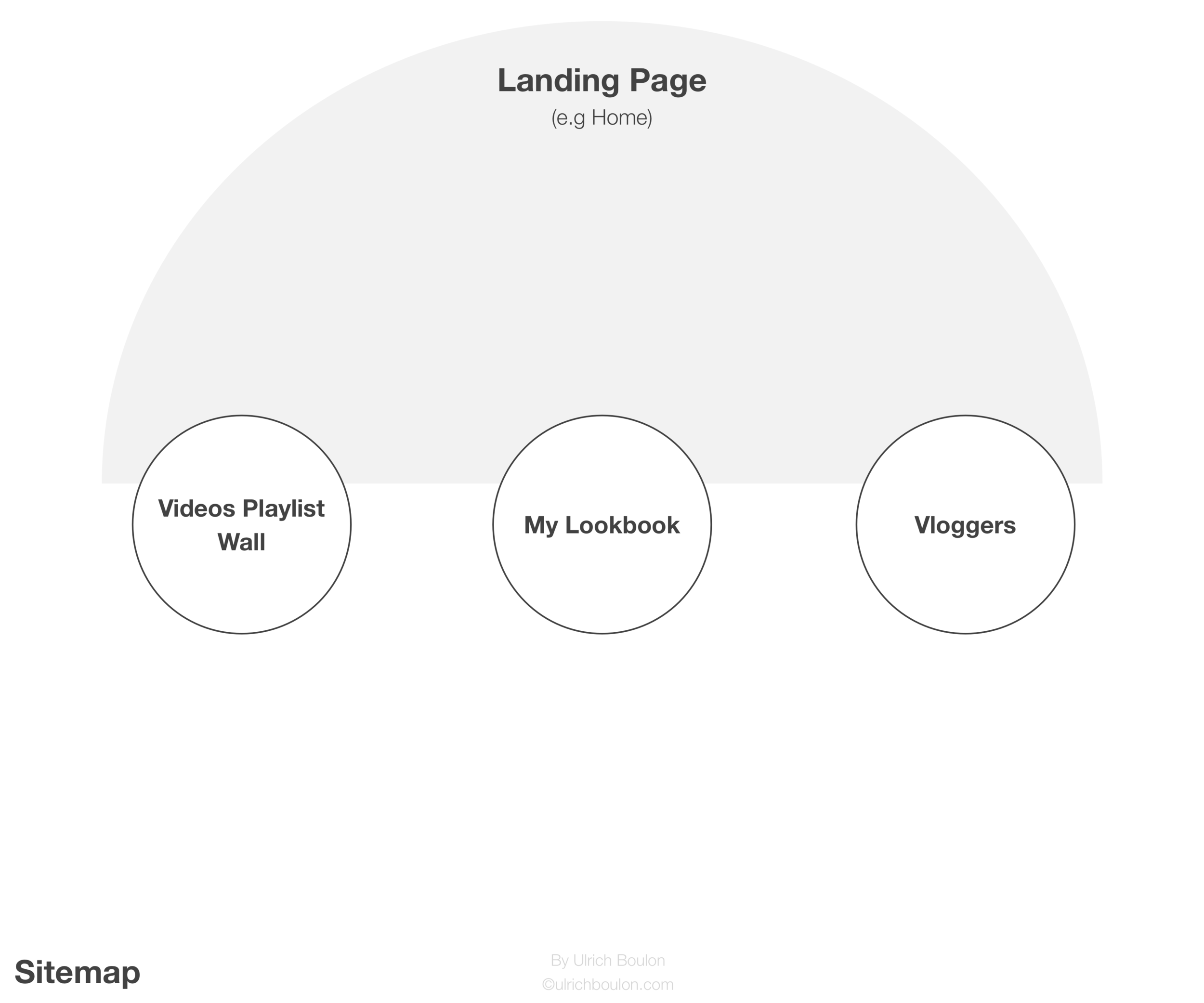

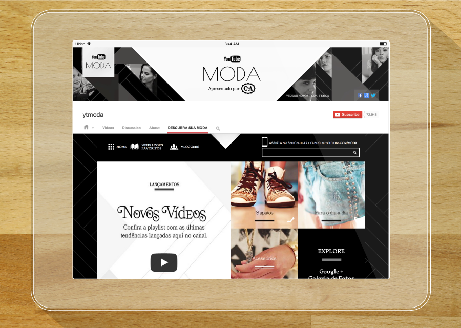
VIDEOS PLAYLIST WALL
The wall experience allows to create an extra layer of curated and featured content. These extra doors (playlists, signpost to a vlogger page, advertising) help the user browses and filters the content.
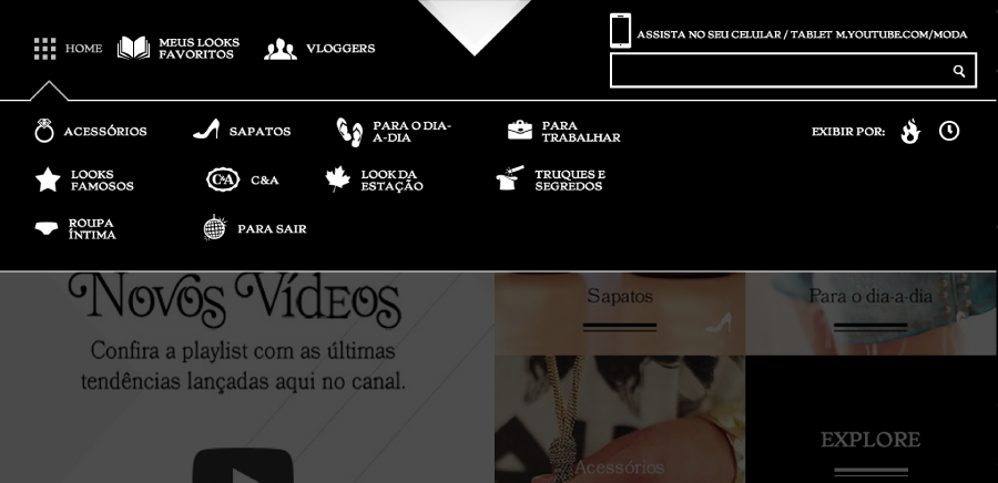
FILTERING/SEARCHING
Because of the weekly update and the exponential number of MODA's vloggers. The user is able to browse by category (jewellery, pants, shirts, etc.) and to sort by last video uploaded or most relevant.
I chose to relate the search with the blogger's name/tags/categories.
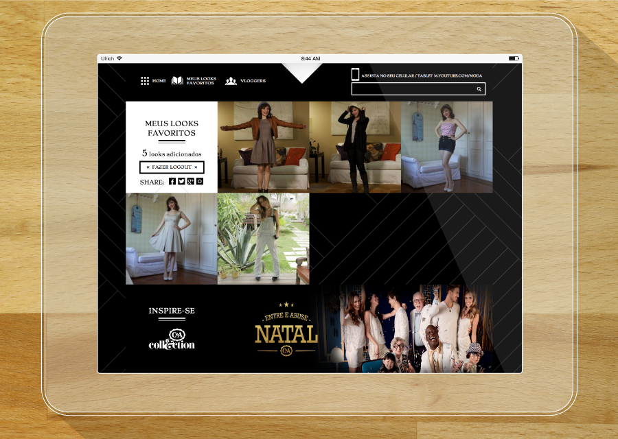
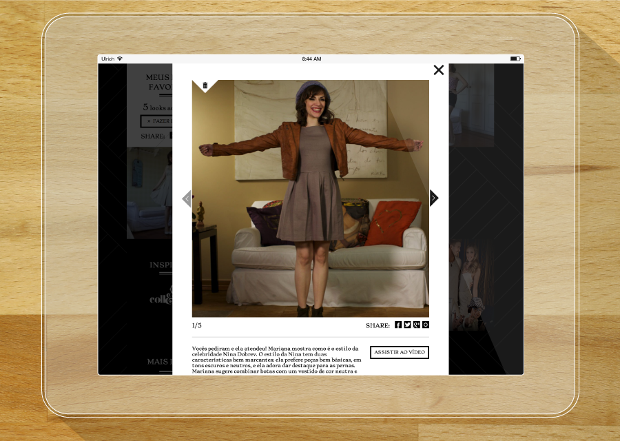
MY LOOKBOOK PAGE
My Lookbook is the engaging piece. The user can while watching a video add a curated item to her/his lookbook. Add/save a new item allow requires Google Plus connect API (required by Google). The user can henceforth inspect, share this album on G+ or go to the C&A shop to buy this item.
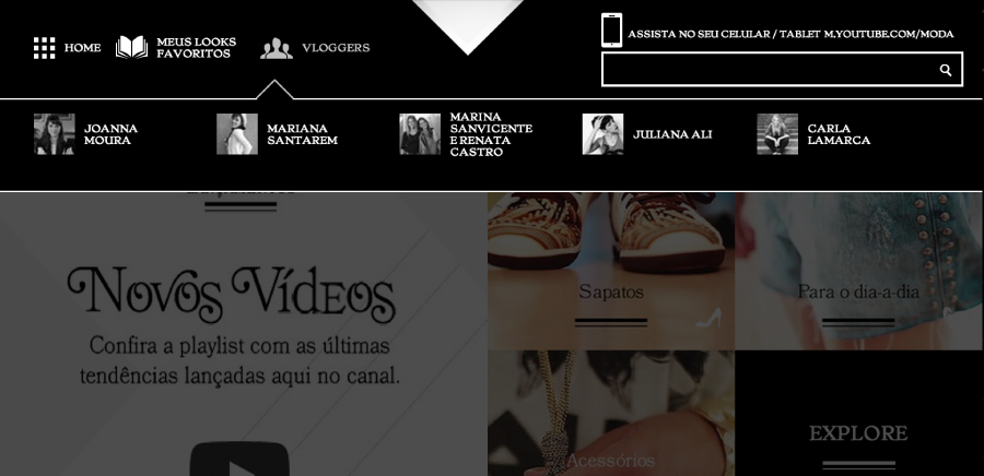
VLOGGER PAGE
To recreate a user - fan - her/his vlogger we brought up this dedicated section where the vlogger could have her/his own space with related information such as a biography, related videos and social links.
Try out this quick overview of the primary navigation:

DAY 2: SORT OUT THE GRID
Early sketches to express the direction, work out a responsive grid without scare the developers was a challenge.
Click to enlarge
High fidelity layout to define the breakpoints helped me out with the responsiveness of the design.
Click to enlarge
Overview with the 3-up (1060 px, 850 px, 640 px) resolution following the Youtube's layout.
Click to enlarge
DAY 3&4: INTERACTIVE BITS AND HIGH FIDELITY WIREFRAMES
- AUTOMATIC SCROLL TO REVEAL THE VIDEO PLAYLIST
- DESIGN A CUSTOM PLAYER TO INTERACT WITH AND CREATE AN ENGAGING EXPERIENCE
Add an item will populate the user's lookbook.

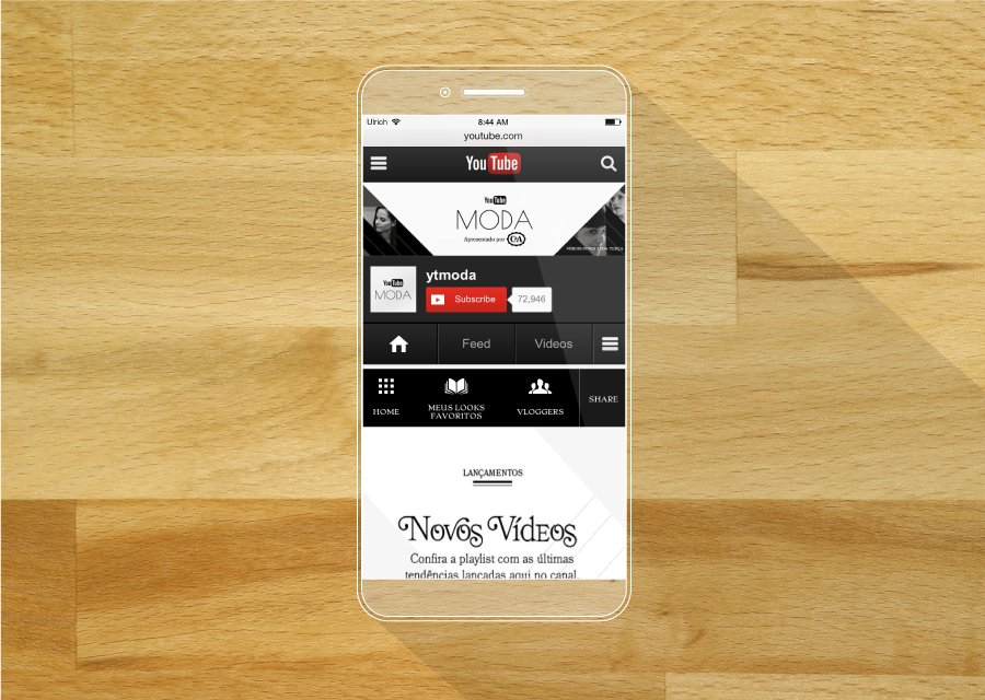
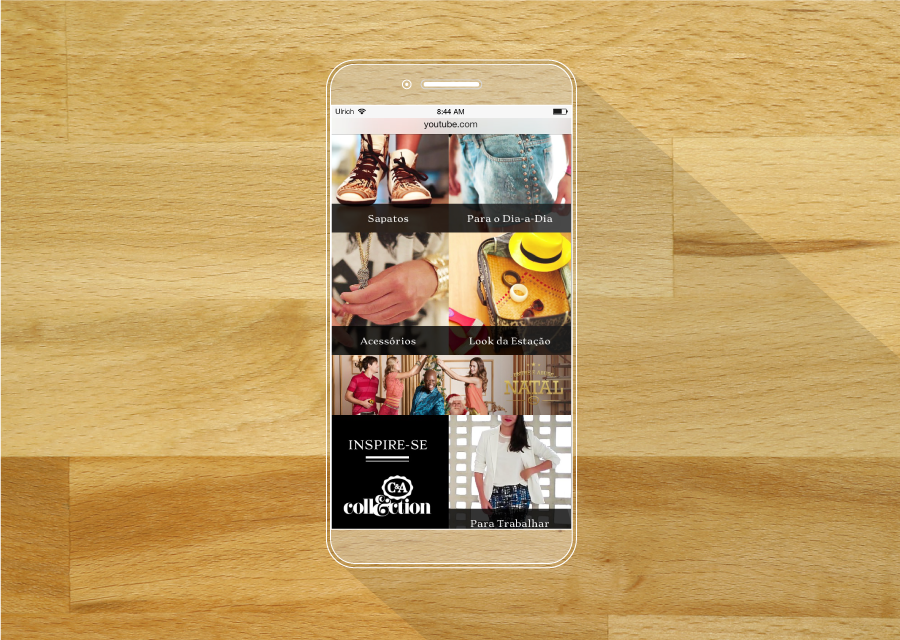
DAY 5: MOBILE VERSION


Although considering the grid defined for the desktop and tablet resolution, a new layout has been defined for the mobile removing features and too heavy functionalities. It is not a responsive version of the desktop and tablet but a total new layout - even if it looks like for consistency on the design - but also keeping the same information architecture.

Hope you enjoyed reading Youtube MODA Channel's case study.
Below are some feedbacks from Google and C&A, just before the final showcase where you can find the credits and the main screens (in color this time!) designed by Cubo.
FEEDBACKS
“Congratulations! This is not a renewal, it’s an evolution!”
“Thanks to everyone! The Moda channel is amazing. We all super aligned and the channel is beautiful and super functional too!”
SHOWCASE TIME