TAKEAWAYS TO CRACK ON
Small business owners want to lighten their workload and improve their business by focusing on its direct benefits, which is where Google Apps come in.
Google wants to clear up the confusion and show the simplicity and effectiveness of the product.
Addressing users who drop off because of:
- Reluctance to leave current system
- Reluctance to learn a new system
- Fear it will take too long to learn
- Fear it will cost too much to change
- Misunderstandings of the product
WHAT WE DID
The team decided to design business experiences into simple, inspirational moments that make a lasting impression on users. Through video, real life business scenarios and narratives, these moments humanize the benefits of Google Apps so they leave a lasting impression on users. This experience removes the hurdle that still stands between users learning about Google Apps and signing up/adopting it into their best practices.
HERE'S WHAT I DID AND HOW I DID IT
DAY 1: DEAL WITH THE BRIEF AND THE INFORMATION ARCHITECTURE
- MORNING: BREAK DOWN THE BRIEF
Knowing that I have two days to suggest a design approach for this project, I started read the brief and the pitch which were well explained and detailed with customer insights, products features & benefits and this sentence:
Starting with some of the common frustrations lead users to explore more about the advantages of Google Apps over their current work style.
Therefore, few ideas came up:
- One-page, long scrolling
- Storytelling journey
- Combination of video, product animations & tutorials
topics divided into everyday acts (Share, Connect, Create, Communicate, Plan, Record, Security…)
testimonial videos from real life businesses who have realized their personal Moments of 'Aha' (personal rewarding emotion) with Google Apps.

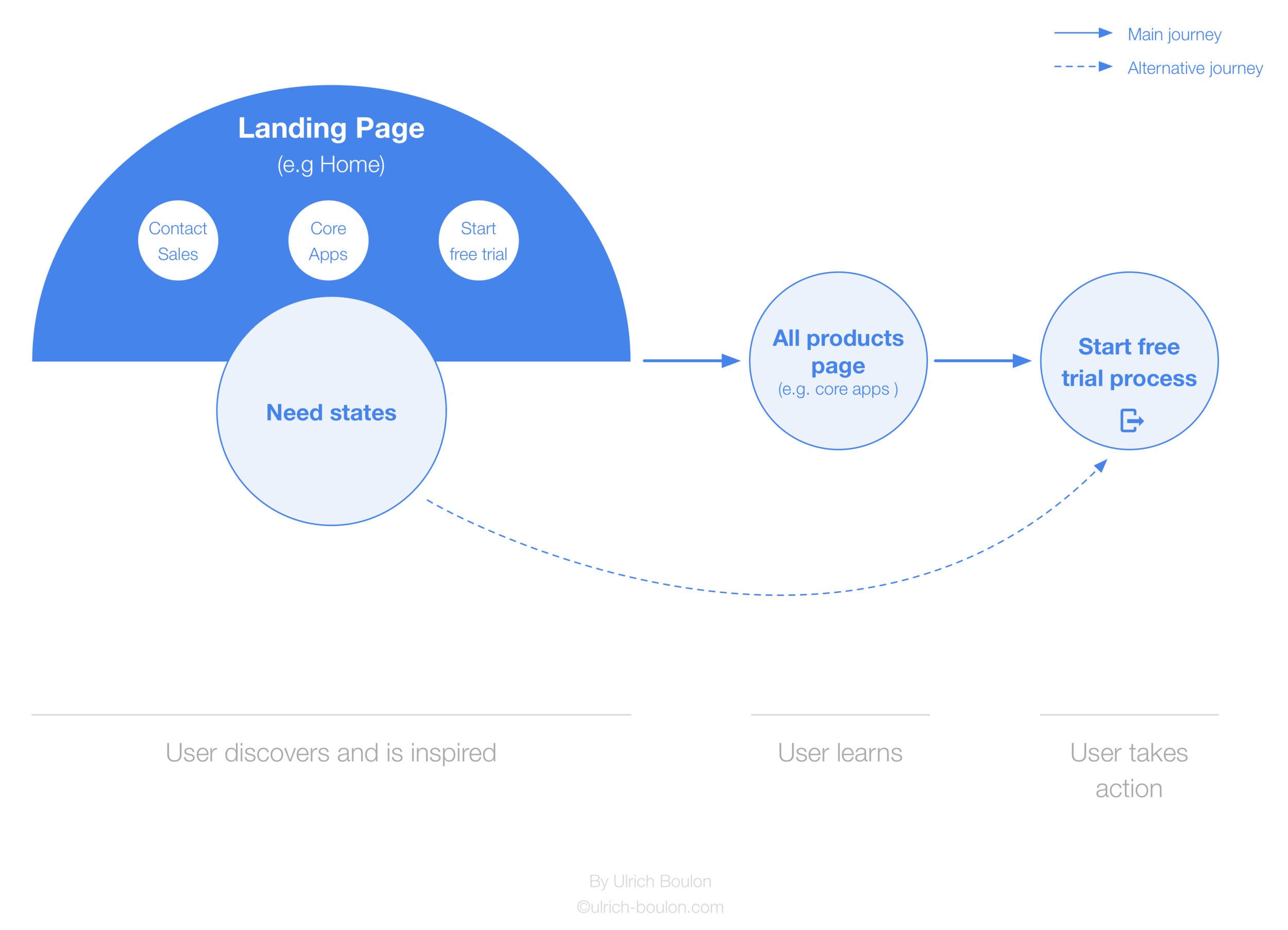
- AFTERNOON: DISCOVER / INSPIRE / LEARN / TRY IT!
DAY 2 - DRAW THE PICTURE
- MORNING: LAYOUT THE THINKINGS
Whiteboarding is always a first step that I use to map out my thinkings or the wireframes. I do like my Moleskine, but I found it less obvious when I have to iterate on ideas with the team.

...Then I can start to clean the overall on Omnigraffle. What's a tool (after few years of usage, I am still happy and faithful to it)
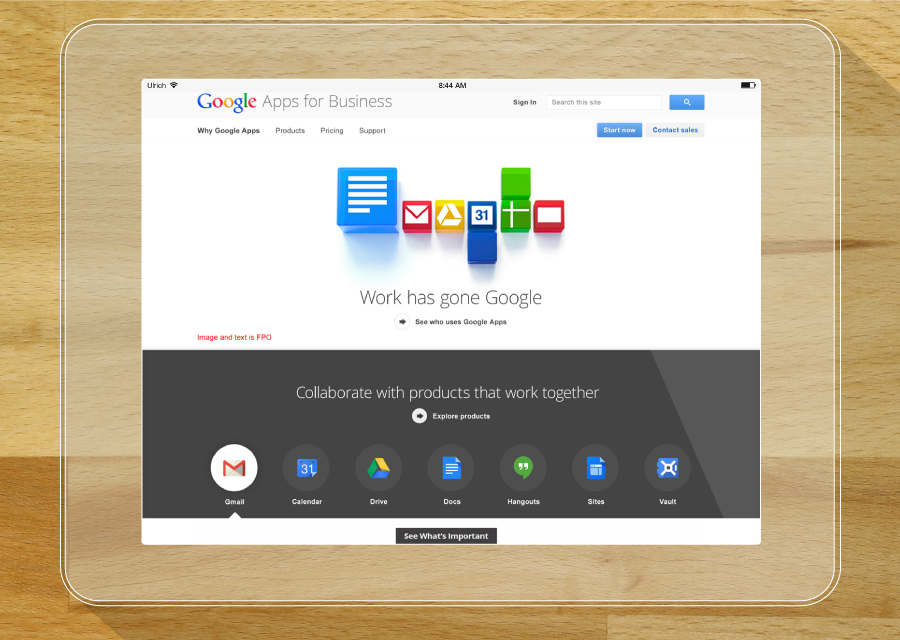
Homepage inner-navigation
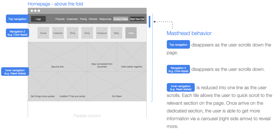
The tiles wall
Each tile allows the user to quickly scroll to the relevant section on the page. Once arrive on the dedicated section, the user is able to get more information via a carousel (right side arrow) to reveal more.
Click to enlarge
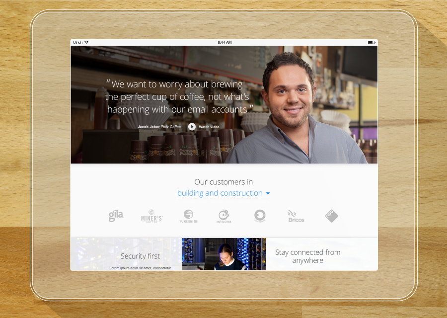
The carousel
The right side arrow appears only if there is more content within the consulted section. While the left arrow appears after the first click on the right arrow allowing the user learn more about the need or product.
Click to enlarge
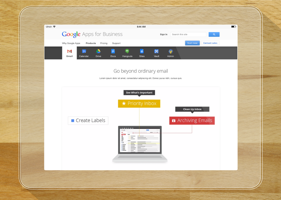
All products (e.g. Core Apps) inner-navigation

The inner navigation allows the user switch between apps and reach quickly the related app content section.

- AFTERNOON: IT'S TIME TO ROLL EVERYTHING OUT
Hope you enjoyed reading Google Apps for business case study.
More will come soon. Just watch the space and enjoy the show...
FEEDBACKS
““Aha!””
SHOWCASE TIME